Warm Colour Pops
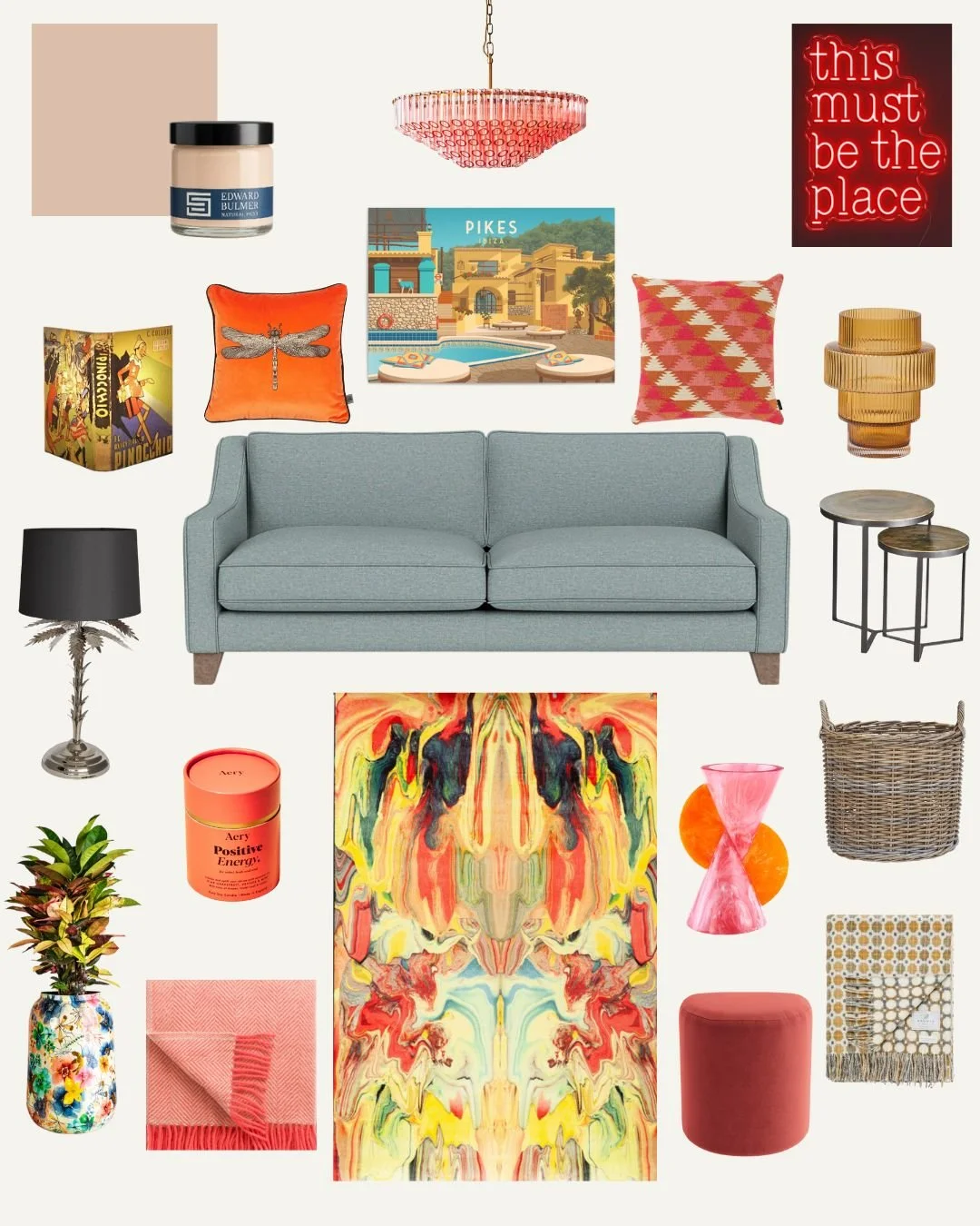
As a child of the 80s, I don’t think I’ll ever be free of the thrill that comes with seeing a flash of neon, a ferocious colour clash and meaningless whimsy, where more is more, nothing goes but anything goes.
In this era, though, I’m drawn to soft backdrops, natural textures and the sense of calm and quiet in a space, but with the little noises and accents that warm pops of colour bring.
Every room in my home has a muted-ish background which sets the stage for colour, character and personality, so this week’s Edit theme is Warm Colour Pops, because you can have both calm and colour if you do it right.
I’ve taken most of my influences here from my lounge, which is our happy space.
Think soft teal with crimson red, blush with sunshine yellow, electric blue with hot pink; grown-up nods to the fearless combinations we grew up with, but a lot less garish!
My interiors compass is faithfully guided by calm foundations, joyful warm colour, texture, warmth, nostalgia and life, all living happily side by side.