Colour Stories - Apricot and Teal
I’ve lived in quite a few different properties over the years and have always styled each one according to the personality and vibe I felt from the house.
There was the mews house full of character and colour (I went bold with pink and green in that era, which I still love), a modern property where I leaned into neutrals with pale blue and rich chocolate brown accents, and a flat that was a comforting, elegant cocoon of fifty shades of beige (which I also adored).
When we bought The Dairy, I ended up ditching all the mood boards and colour schemes I’d planned. Living in and ‘feeling’ the property changed everything.
I took inspiration instead from the views, landscapes and nature right outside our windows and the changing light coming into the home.
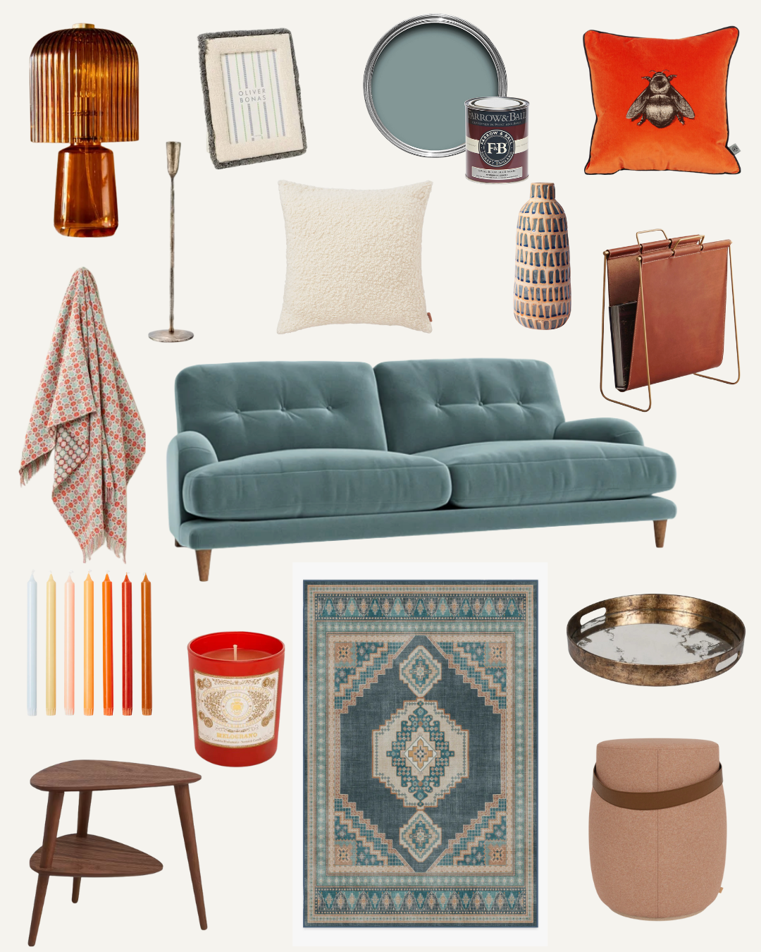
Nature is as much about vivid, jewel-like tones as it is soft neutrals, so my approach here was to use natural colours as the backdrop and then bring the rooms to life with those pops of colour that nature surprises us with – crimson red, emerald green, burnt orange, bright teal blue.
I also layered in inspiration from the places we’ve travelled and the memories we’ve made. The wooden Pinocchio in the hallway came from Florence, where Andrew and I got married, the Santa Maria Novella Melograno Candle came from there too, the painting of Pikes in Ibiza where we went for our first post-pandemic boogie when the world opened up again and the picture of the Square Lighthouse in Islay where we got engaged.